# Option 1: Install at the same time
#install.packages(c("ggplot2", "plotly", "readr", "dplyr", "lubridate", "gganimate", "ape", "ggtree", "RColorBrewer", "gplots", "reshape2","gridGraphics","igraph","ggraph"))

# Option 2: Install seperately
#install.packages("ggplot2")
#install.packages("plotly")
#install.packages("readr")
#install.packages("dplyr")
#install.packages("lubridate")
#install.packages("gganimate")
#install.packages("ape")
#install.packages("ggtree")
#install.packages("RColorBrewer")
#install.packages("gplots")
#install.packages("reshape2")
#install.packages("gridGraphics")
#install.packages("igraph")
#install.packages("ggraph")Plot Twist: Bringing Your ggplot2 Visuals to Life with ggplotly
Introduction
This workshop introduces ggplotly, which bridges ggplot2 and plotly to create interactive graphics in R.
You will learn how to:
Start with basic plots using
ggplot2Add interactivity with
ggplotlyExplore case studies (health data, COVID‑19, malaria genomics)
Save and share interactive plots
Setup
Install required packages if not already installed:
Load libraries:
library(ggplot2)
library(plotly)
library(readr)
library(dplyr)
library(lubridate)
library(gganimate)
library(ape)
library(ggtree)
library(RColorBrewer)
library(gplots)
library(reshape2)
library(gridGraphics)
library(igraph)
library(ggraph)
Warm‑up Example: mtcars
Let’s begin with the built‑in dataset mtcars.
When we create a scatter plot with ggplot2 using the mtcars dataset, we get a static figure. By wrapping the same plot in ggplotly(), it becomes interactive.
The interactive version lets you explore the data more dynamically: you can click legend items to hide or show categories, hover over points to see their exact values, and zoom or pan within the plot for a closer look.
p <- ggplot(mtcars, aes(x = wt, y = mpg, color = factor(cyl))) +
  geom_point() +
  labs(title = "MPG vs Weight", color = "Cylinders")

# Static
p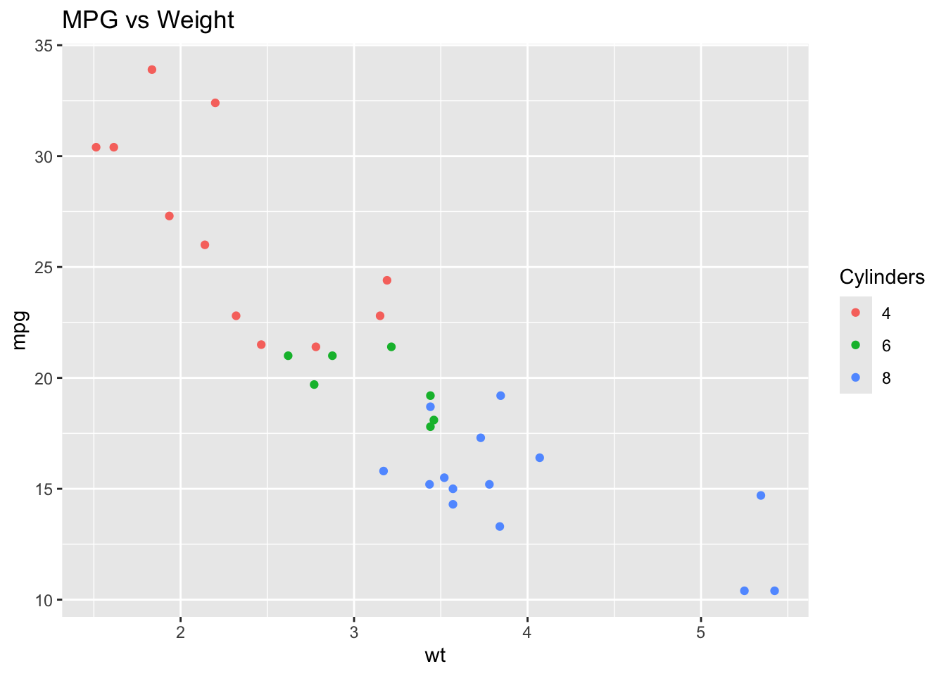
# Interactive
ggplotly(p)
✅ Try hovering over points, clicking legend items, and zooming in!
Case Study 1: Health Data
Research Question: How does age and lifestyle (e.g., smoking, exercise) influence blood pressure across regions?
df <- read.csv("data/simulated_health_data_with_biomarkers.csv")Scatterplots
p1 <- ggplot(df, aes(x = age, y = blood_pressure)) +
  geom_point(alpha = 0.7) +
  labs(title = "Age vs Blood Pressure")

ggplotly(p1)
Purpose: Shows the relationship between two continuous variables (e.g., age vs blood pressure).
Why: Helps us see general patterns (e.g., older individuals may have higher blood pressure).
Add smoking:
p2 <- ggplot(df, aes(x = age, y = blood_pressure, color = smoker)) +
  geom_point(alpha = 0.7) +
  labs(title = "Blood Pressure by Age and Smoking")

ggplotly(p2)
Exercise
Add color = smoker to see if smoking status influences the age–blood pressure relationship.
Try changing the shape by exercise_level.
Solution
p1_sol <- ggplot(df, aes(x = age, y = blood_pressure, color = smoker, shape = exercise_level, text = paste(“Sample:”, subject_id, “
Region:”, region, “
Exercise:”, exercise_level))) + geom_point(alpha = 0.7) + labs(title = “Age vs Blood Pressure by Smoking & Exercise”)
ggplotly(p1_sol, tooltip = “text”)
Multivariate Plot
p3 <- ggplot(df, aes(x = age, y = blood_pressure, color = smoker, shape = exercise_level, text = label)) +
  geom_point(alpha = 0.7) +
  labs(title = "Interactive Scatter: Age, BP, Smoking, Exercise")

ggplotly(p3, tooltip = "text")- Purpose: Adds more variables (smoking status, exercise level) using color, shape, or tooltip labels.
- Why: Real-world health outcomes are influenced by multiple factors, so we want to see how lifestyle intersects with age and blood pressure.
Box & Violin Plots
p4 <- ggplot(df, aes(x = exercise_level, y = blood_pressure, fill = exercise_level)) +
  geom_boxplot(alpha = 0.7) +
  labs(title = "Blood Pressure by Exercise Level")

ggplotly(p4)
p_violin <- ggplot(df, aes(x = smoker, y = blood_pressure, fill = smoker)) +
geom_violin(alpha = 0.6) +
geom_boxplot(width = 0.1, fill = "white", outlier.shape = NA) +
labs(title = "Distribution of Blood Pressure by Smoking Status")
ggplotly(p_violin)- Purpose: Summarise the distribution of blood pressure across groups (e.g., smoker vs non-smoker, different exercise levels).
- Why: Helps compare variability, medians, and outliers between groups. Violin plots additionally show the distribution shape.
Exercise
Change this to a violin plot (
geom_violin) to see the distribution of blood pressure within each exercise group.Add jittered points with
geom_jitter()to see individual values.
Faceting by Region
p5 <- ggplot(df, aes(x = age, y = blood_pressure, color = smoker, text = label)) +
  geom_point(alpha = 0.7) +
  facet_wrap(~region) +
  labs(title = "Blood Pressure by Region")

ggplotly(p5, tooltip = "text")- Purpose: Splits the dataset into subplots (e.g., by region).
- Why: Allows comparison across categories without overloading a single plot. For example, we can ask: Is the age–blood pressure relationship consistent across rural, suburban, and urban regions?
Correlation Heatmap
corr_data <- df %>% select(age, blood_pressure, bmi, cholesterol)
corr_mat <- round(cor(corr_data, use = "pairwise.complete.obs"), 2)
melted <- melt(corr_mat)

p_corr <- ggplot(melted, aes(Var1, Var2, fill = value)) +
  geom_tile(color = "white") +
  geom_text(aes(label = value)) +
  scale_fill_gradient2(low = "blue", mid = "white", high = "red", midpoint = 0) +
  labs(title = "Correlation Heatmap")

ggplotly(p_corr)
Purpose: Display pairwise correlations between multiple numeric health indicators (age, blood pressure, BMI, cholesterol).
Why: Provides a quick overview of which factors are most strongly related.
Summary of Findings (Case Study 1)
Blood pressure tends to increase with age.
Smokers may have higher blood pressure compared to non-smokers.
Exercise level appears to influence blood pressure distribution (lower in higher exercise groups).
Correlation analysis highlights potential links between health indicators (e.g., BMI and blood pressure).
Regional differences emerge when using facets, suggesting environment also matters.
Why Use ggplotly for Interactivity?
Enhanced Exploration
Hovering shows exact values (age, BP, lifestyle factors).
Tool tips allow inclusion of metadata (subject ID, labels).
Data Filtering
- Legends are clickable — users can hide/show smokers, exercise levels, or regions.
Zoom & Pan
- Users can focus on sub-ranges (e.g., ages 20–40 or BP > 160).
Communication
- Interactive plots are more engaging for teaching, reporting, or sharing with non-technical audiences.
Advantages of these Analyses
Capture both overall patterns and group-specific differences.
Combine exploratory (scatter, violin) and summary (boxplot, heatmap) approaches.
Facilitate hypothesis generation — e.g., does exercise buffer age-related blood pressure increases?
Reflection
Which lifestyle factor (smoking, exercise, BMI, cholesterol) showed the strongest relationship with blood pressure?
Did faceting by region or age group reveal any new patterns?
Write down 2–3 sentences summarising your findings.
Case Study 2: COVID-19
Research Question: How did COVID‑19 strains spread over geography and time?
# Load the dataset
df <- read.csv("data/simulated_covid_strains.csv")
rownames(df) <- df$sample_id

glimpse(df)
Rows: 800
Columns: 8
$ sample_id <chr> "SMP_0001", "SMP_0002", "SMP_0003", "SMP_0004", "SMP…
$ country <chr> "Australia", "Australia", "USA", "USA", "South Afric…
$ strain <chr> "Beta", "Gamma", "Delta", "Gamma", "Omega", "Mu", "A…
$ collection_date <chr> "2021-09-10 09:16:53.767209008", "2021-11-24 19:11:3…
$ genome_similarity <dbl> 99.29, 99.06, 99.42, 99.02, 98.71, 98.36, 100.25, 99…
$ mutations <int> 18, 7, 22, 5, 19, 11, 12, 9, 16, 10, 22, 11, 10, 10,…
$ latitude <dbl> -37.83968, -34.00180, 40.69675, 40.63568, -34.26360,…
$ longitude <dbl> 144.6830509, 151.0265115, -73.6722495, -74.0420914, …summary(df) sample_id country strain collection_date
Length:800 Length:800 Length:800 Length:800
Class :character Class :character Class :character Class :character
Mode :character Mode :character Mode :character Mode :character
genome_similarity mutations latitude longitude
Min. : 96.92 Min. : 3.00 Min. :-38.41 Min. :-118.43
1st Qu.: 98.57 1st Qu.:10.00 1st Qu.:-23.04 1st Qu.: -47.20
Median : 98.99 Median :13.00 Median : 35.61 Median : 15.89
Mean : 99.01 Mean :13.52 Mean : 20.99 Mean : 20.28
3rd Qu.: 99.42 3rd Qu.:16.00 3rd Qu.: 48.21 3rd Qu.: 77.14
Max. :100.88 Max. :26.00 Max. : 60.77 Max. : 151.89 table(df$strain)
  Alpha    Beta   Delta Epsilon   Gamma  Lambda      Mu   Omega Omicron   Sigma
     70      82      71      33      86      69      70      41      63      77
  Theta    Zeta
     71      67
Geographic Spread
strain_summary <- df %>%
  group_by(country, strain) %>%
  summarise(count = n(), latitude = mean(latitude), longitude = mean(longitude), .groups = "drop")

plot_geo(strain_summary) %>%
  add_markers(x = ~longitude, y = ~latitude, size = ~count, color = ~strain,
              text = ~paste("Country:", country, "<br>Strain:", strain, "<br>Count:", count),
              hoverinfo = "text") %>%
  layout(title = "COVID‑19 Strain Frequency by Country",
geo = list(scope = "world", projection = list(type = "natural earth")))Purpose: Visualise where strains occur and how frequently in each country.
Why: Shows global spread and geographic hotspots of different strains.
Exercise
Change
scope = "world"to"asia"or"europe"to zoom in on specific regions.Try coloring by country instead of strain.
Time Trends
df <- df %>% mutate(month = floor_date(as.Date(collection_date), "month"))

strain_trend <- df %>% group_by(month, strain) %>% summarise(count = n(), .groups = "drop")

timeline <- ggplot(strain_trend, aes(x = month, y = count, color = strain)) +
  geom_line(size = 1) +
  labs(title = "Strain Evolution Over Time")

ggplotly(timeline)Purpose: Track strain counts over time.
Why: Lets us see how specific variants emerge, rise, and decline.
Exercise
Change the x-axis to
yearonly (aggregate withlubridate::year()).Add
facet_wrap(~country)to compare strain dynamics between countries.
Solution
strain_trend_year <- df %>%
mutate(year = lubridate::year(month)) %>%
group_by(year, strain, country) %>%
summarise(count = n(), .groups = “drop”)
timeline_sol <- ggplot(strain_trend_year, aes(x = year, y = count, color = strain)) +
geom_line(size = 1) +
facet_wrap(~country) +
labs(title = “Strain Evolution Over Years by Country”)
ggplotly(timeline_sol)
Relative Proportions
strain_trend_prop <- df %>%
  group_by(month) %>% mutate(total = n()) %>%
  group_by(month, strain) %>% summarise(prop = n()/unique(total), .groups="drop")

p_area <- ggplot(strain_trend_prop, aes(x = month, y = prop, fill = strain)) +
  geom_area(alpha = 0.8) +
  scale_y_continuous(labels = scales::percent) +
  labs(title = "Relative Frequency of Strains Over Time")

ggplotly(p_area)- Purpose: Show the proportion of each strain at different time points.
- Why: Easier to see when one strain becomes dominant over others, even if total case numbers vary.
Phylogenetic Tree
mut_matrix <- dist(df$mutations)
tree <- nj(mut_matrix)
tree$tip.label <- df$sample_id

strain_colors <- scales::hue_pal()(length(unique(df$strain)))

ggtree(tree, layout = "circular", aes(color = strain)) %<+% df +
  geom_tree(color = "gray70") +
  geom_tippoint(size = 2) +
  scale_color_manual(values = strain_colors)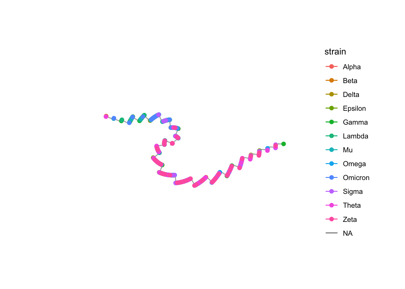
- Purpose: Display genetic relationships between samples.
- Why: Reveals how strains are related, showing clusters, divergence, and evolutionary history.
Summary of Findings (Case Study 2)
Different strains are distributed unevenly across the globe.
Some strains rise quickly over time while others decline.
Dominance shifts are clear when looking at relative proportions (e.g., one variant replaces another).
Phylogenetic analysis confirms these dynamics, showing how strains diverge from common ancestors.
Why Use ggplotly for Interactivity?
Maps: Hover to see country, strain, and sample count; zoom to specific regions.
Timelines: Hover reveals exact counts per strain per month.
Stacked Areas: Clicking legend items lets you isolate or compare particular strains.
Trees: Tool tips can add sample IDs, making phylogenetics more interpretable.
Advantages of These Analyses
Integrates epidemiology (spread in space and time) with genomics (strain evolution).
Makes it easier to communicate both patterns (e.g., global dominance of one strain) and details (e.g., a country-specific outbreak).
Interactivity allows policymakers, scientists, and the public to explore the data themselves.
Helps answer complex questions: Where did new strains appear first? How quickly did they spread? How are they genetically related?
Reflection
Which strains spread most rapidly across regions?
Did the timeline show any waves of infection linked to specific variants?
Summarise the key insight from the interactive plots in 2–3 sentences.
Case Study 3: Malaria Genomics
Research Question: How can we identify and visualize the spread of drug resistance in malaria parasite populations?
genome_data <- read.csv("data/simulated_malaria_genome_data_with_fst.csv")
#shared_segments <- read.csv("data/simulated_malaria_shared_gene_links.csv")
ld_matrix <- as.matrix(read.csv("data/simulated_malaria_ld_matrix_chr1.csv", row.names = 1))

malaria <- read.csv("data/simulated_malaria_drugresistance.csv")

# Ensure gene_id is row names of LD matrix
rownames(ld_matrix) <- colnames(ld_matrix)
PCA/DAPC
p1 <- ggplot(malaria, aes(x=PC1, y=PC2, color=resistance,
                          text=paste("Sample:", sample_id,
                                     "<br>Region:", region,
                                     "<br>Year:", year))) +
  geom_point(size=3, alpha=0.7) +
  labs(title="Population Structure of Malaria Parasites",
       x="PC1", y="PC2")

ggplotly(p1, tooltip="text")Purpose: Show overall genetic structure of parasite populations.
Why: Helps detect clustering of resistant vs. sensitive parasites and highlights whether resistance is spreading within or across regions.
Interactivity adds hover labels (sample, region, year) so you can connect points to metadata.
Exercise
Recolor this PCA by region instead of resistance.
Add
facet_wrap(~year)to compare across years.
Distribution of FST
p_fst <- ggplot(genome_data, aes(x = fst)) +
  geom_histogram(bins = 30, fill = "steelblue", alpha = 0.7) +
  labs(title = "Distribution of FST Across Genes")

ggplotly(p_fst)Purpose: Quantify genetic differences between parasite populations (e.g., across regions or years).
Why: Helps identify regions of the genome under selection or where populations are diverging.
Manhattan Plot
p_manhattan <- ggplot(genome_data, aes(x = start, y = fst, color = species, text = gene_id)) +
  geom_point(alpha = 0.6) +
  facet_wrap(~chr, scales = "free_x") +
  labs(title = "FST Across Chromosomes")

ggplotly(p_manhattan, tooltip = "text")
GWAS
p2 <- ggplot(malaria, aes(x=snp_pos, y=-log10(pval),
                          color=factor(snp_chr),
                          text=paste("Chr:", snp_chr,
                                     "<br>Pos:", snp_pos,
                                     "<br>P:", signif(pval,3)))) +
  geom_point(alpha=0.7) +
  labs(title="GWAS Manhattan Plot for Drug Resistance",
       x="Genomic Position", y="-log10(p-value)") +
  theme_minimal()

ggplotly(p2, tooltip="text")- Purpose: Identify SNPs associated with drug resistance.
- Why: Allows quick spotting of genomic “peaks” (e.g., on chromosome 7) that may correspond to known drug resistance genes (pfcrt, pfmdr1).
- Interactivity lets you zoom in, filter chromosomes, and hover to see SNP details.
Exercise
Zoom into chromosome 7 to see the strong association peak.
Add
facet_wrap(~region)to compare signals between regions.
Solution
p2_sol <- ggplot(malaria %>% filter(snp_chr == 7), aes(x = snp_pos, y = -log10(pval), color = region, text = paste(“SNP:”, snp_chr, “
Pos:”, snp_pos, “
P:”, signif(pval, 3)))) + geom_point(alpha = 0.7) + labs(title = “GWAS Results: Chromosome 7, by Region”)
ggplotly(p2_sol, tooltip = “text”)
Drug resistance Prediction Plot
p3 <- ggplot(malaria, aes(x=freq, y=resistant_binary,
                          color=resistance,
                          text=paste("Sample:", sample_id,
                                     "<br>Allele Freq:", round(freq,2),
                                     "<br>Status:", resistance))) +
  geom_jitter(height=0.05, alpha=0.7) +
  geom_smooth(method="glm", method.args=list(family="binomial"),
              se=FALSE, color="black") +
  labs(title="Predicted Probability of Resistance",
       x="Allele Frequency", y="Resistance (0/1)")

ggplotly(p3, tooltip="text")Purpose: Visualize the probability of resistance given allele frequency.
Why: Shows how certain mutations strongly predict drug resistance status.
Interactivity lets you hover over points to see which individuals drive the relationship.
Exercise
- Add hover text to show
sample_id.
Drug resistance Spread over time
res_trend <- malaria %>%
  group_by(year, region) %>%
  summarise(resistant_rate = mean(resistant_binary),
            n=n(), .groups="drop")

p4 <- ggplot(res_trend, aes(x=year, y=resistant_rate,
                            color=region,
                            text=paste("Region:", region,
                                       "<br>Year:", year,
                                       "<br>Resistant Rate:", round(resistant_rate,2),
                                       "<br>n:", n))) +
  geom_line(size=1) +
  geom_point(size=2) +
  labs(title="Spread of Resistance Over Time",
       x="Year", y="Resistance Frequency") +
  theme_minimal()

ggplotly(p4, tooltip="text")
Purpose: Track how resistance frequency changes across regions and years.
Why: Reveals whether resistance is spreading in particular areas (e.g., rapid increase in SE Asia after 2015).
Interactivity makes it easy to hover for exact rates, zoom into certain years, and compare regions.
Exercise
Restrict the time window to
year >= 2010.Try faceting by
regionfor clearer comparison.
Solution
res_trend_recent <- malaria %>% filter(year >= 2010) %>% group_by(year, region) %>% summarise(resistant_rate = mean(resistant_binary), n = n(), .groups = “drop”)
Faceted plot by region
p4_sol <- ggplot(res_trend_recent, aes(x = year, y = resistant_rate, color = region, text = paste(“Region:”, region, “
Year:”, year, “
Resistant Rate:”, round(resistant_rate, 2), “
n:”, n))) + geom_line(size = 1) + geom_point(size = 2) + facet_wrap(~region) + labs(title = “Spread of Resistance Over Time (since 2010)”, x = “Year”, y = “Resistance Frequency”) + theme_minimal()
ggplotly(p4_sol, tooltip = “text”)
p2_sol <- ggplot(malaria %>% filter(snp_chr == 7), aes(x = snp_pos, y = -log10(pval), color = region, text = paste(“SNP:”, snp_chr, “
Pos:”, snp_pos, “
P:”, signif(pval, 3)))) + geom_point(alpha = 0.7) + labs(title = “GWAS Results: Chromosome 7, by Region”)
ggplotly(p2_sol, tooltip = “text”)
IBD Network Connectivity
Why: Explore who is connected to whom via identical-by-descent (IBD) sharing, a direct marker of transmission.
Animated across timepoints to visualize transmission spread.
Interactivity lets learners hover on nodes/edges to see sample IDs, regions, and IBD values.
Tip
Try to first filter the data for one year and plot the network.
Then, extend it into an animation to see how connectivity evolves.
# Load data
samples <- read_csv("data/malaria_samples_updated.csv")
edges   <- read_csv("data/malaria_ibd_edges_updated.csv")
# Build global network
g <- graph_from_data_frame(d = edges, vertices = samples, directed = FALSE)
# Animated IBD network using gganimate
p_anim <- ggraph(g, layout = "fr") +
geom_edge_link(aes(width = ibd, alpha = ibd), color = "darkred") +
geom_node_point(aes(color = country,
text = paste("Sample:", name,
"<br>Region:", country,
"<br>Year:", year))) +
theme_void() +
scale_edge_width(range = c(0.3, 2)) +
labs(title = "IBD Network Over Time", subtitle = "Year: {closest_state}") +
transition_states(year, transition_length = 2, state_length = 1) +
ease_aes("cubic-in-out")
animate(p_anim, nframes = 40, fps = 4, width = 800, height = 600)# Example: interactive network for one year (2013)
g_year <- graph_from_data_frame(
d = edges %>% filter(year == 2013),
vertices = samples,
directed = FALSE
)
# Layout coordinates
coords <- layout_with_fr(g_year)
coords_df <- data.frame(coords)
names(coords_df) <- c("x", "y")
coords_df$sample_id <- V(g_year)$name
coords_df$country <- V(g_year)$country
coords_df$year <- V(g_year)$year
# Edge data
edge_df <- data.frame(get.edgelist(g_year))
names(edge_df) <- c("from", "to")
edge_df <- edge_df %>%
left_join(coords_df, by = c("from" = "sample_id")) %>%
rename(x_from = x, y_from = y,
region_from = country, year_from = year) %>%
left_join(coords_df, by = c("to" = "sample_id")) %>%
rename(x_to = x, y_to = y,
region_to = country, year_to = year)
# Interactive plotly network
plot_ly(type = "scatter", mode = "lines") %>%
add_segments(
data = edge_df,
x = ~x_from, y = ~y_from,
xend = ~x_to, yend = ~y_to,
line = list(color = "red", width = 1),
hoverinfo = "none"
) %>%
add_markers(
data = coords_df,
x = ~x, y = ~y,
color = ~country,
text = ~paste("Sample:", sample_id,
"<br>Region:", country,
"<br>Year:", year),
hoverinfo = "text",
marker = list(size = 10)
) %>%
layout(
title = "IBD Network Connectivity (2013)",
xaxis = list(title = NULL, showgrid = FALSE,
zeroline = FALSE, showticklabels = FALSE),
yaxis = list(title = NULL, showgrid = FALSE,
zeroline = FALSE, showticklabels = FALSE)
)Summary of Findings (Case Study 3)
Population structure (PCA): Resistant parasites cluster more strongly in SE Asia, suggesting a regional origin of resistance.
FST highlights loci where populations are genetically diverging — potentially due to selection (e.g., drug resistance).
GWAS Manhattan plot: Strong association signals on chromosome 7, consistent with known drug resistance genes.
Prediction plot: Resistance probability increases sharply with allele frequency at key SNPs.
Dynamics plot: Resistance frequency is rising over time, especially in SE Asia post-2015, with slower spread elsewhere.
IBD networks: revealed direct transmission links and how they evolve year-to-year.
Why Use ggplotly for Interactivity?
Hovering makes it easy to link individuals (in PCA) or SNPs (in GWAS) to metadata.
FST Plots: Zoom in to regions of high differentiation for closer inspection.
Zooming in helps focus on specific genomic regions or time windows.
Legends let you toggle regions, resistance status, or chromosomes on and off.
For teaching and exploration, interactivity makes complex genomics data more approachable.
Hovering lets you read exact SNPs, probabilities, samples, or IBD weights.
Networks become explorable: zoom into highly connected clusters.
Facilitates teaching population genomics interactively.
Advantages of These Analyses
Combines population genetics, evolutionary biology, and visualisation in one workflow.
Helps researchers detect signals of drug resistance, adaptation, and epidemiological shifts.
Interactivity lowers barriers for exploring high-dimensional genomic data.
Useful for both hypothesis generation (which genes might be under selection?) and communication (showing resistance hotspots to policymakers).
Detects drug resistance origins and spread across time and geography.
Links genotype to phenotype in an intuitive, visual way.
Interactivity empowers both scientists and policymakers to explore the data dynamically.
Reflection
Where did drug resistance appear to spread first?
Which SNPs were most strongly associated with resistance?
Summarise the population genomic findings in 2–3 sentences.
Wrap‑Up
ggplotly()turns staticggplot2plots into interactive tools.Interactivity enhances exploration, teaching, and storytelling.
You can save interactive plots as standalone HTML
#htmlwidgets::saveWidget(ggplotly(p1), "health_plot.html")✅ Exercise: Modify one of the plots to use a different dataset, add new variables, or customize tool tips.